


A Plea to Conventions About Name Badges
I have a favor to ask of conventions: please design your badges so that names can be easily and clearly read.
I’ve never been good with names. It’s frustrating as hell, and it’s become a bigger problem as I travel to more conventions. I get introduced to so many people, and within 24 hours, a lot of those names escape my brain like Batman villains from Arkham Asylum.
Most of the time, it’s not that I forget the people — just the names. (Sorry, Darla!) Especially if it’s been a while (folks I see once a year at a given convention, for example) or the context is different. Even when my brain retains a tentative grasp on a name, I tend to not trust myself, and still try to check badges to make sure.
Compare these two badges. The one on the left is from Convergence. The one on the right I made up as an example, but it’s pretty close to some I’ve seen at various conventions.
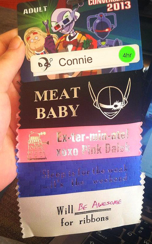
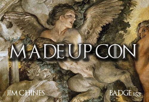
Convergence’s badge is relatively easy to read, with clear black text on white. Even my old eyes should be able to read that at a distance. Whereas the other example uses small type in a non-standard font, and is hard to distinguish from the background.
(This will also give me a better chance of spelling your name correctly if I’m signing a book!)
I know folks like cool artwork on the badges. I know a lot of people are better at remembering names than I am. But please take pity on those of us with older eyes and leaky brains.
Thank you,
Jim and the Society of People Who Suck at Remembering Names
Jason Black
October 10, 2017 @ 3:25 pm
Preach it!
> I know folks like cool artwork on the badges.
Sure, they do. But they forget that a name badge is a tool for achieving a specific purpose. Art’s cool and all, but don’t lose sight of the whole point of a name badge just because you’re too bedazzled by your awesome artwork.
Hugh Staples
October 10, 2017 @ 3:36 pm
Amen!
I agree that art is cool, but there are plenty of other places, such as the main program book cover, to show off your art. 🙂
Kimba Wilson
October 10, 2017 @ 3:52 pm
For all of the cons where Ron and I handled Registration, we put the artwork in a corner and left the whole middle of the badge open (the area where MADEUPCON is on your sample) for the name. Lots of room for people to write their name as large as they wanted. For the preprinted badges (GoHs, ConCom, etc) we would print the name as large as possible in that space. I also used an easily read font for them. (I wanted to be able to read the name without effort when sorting them as well as when they were on people.)
Patti
October 10, 2017 @ 3:53 pm
This also gets my vote. With a reminder that someone with bad eyes might look like a perv if they cann’t see Aristaaaaaaaaaaaaaaaaluna on your badge unless they get within 2 feet of your badge.
Marshall Ryan Maresca
October 10, 2017 @ 4:02 pm
I was at one where A. the badge was a magnet-thing that you could affix to your shirt (or vest) with ease so it stayed put and B. Everyone’s first name was the largest, boldest part of the text, easily devoting 75% of the space to that. You could read the person’s first name from across the lobby. Best. Badges. Ever.
C. J. Czelling
October 10, 2017 @ 4:56 pm
I’m old. Need a big badge, large type, black on white. Otherwise I end up with my nose poked into some lady’s bosom so that I can read her name. Looks rude.
Lee H
October 10, 2017 @ 5:25 pm
Double-sided badges are also a great idea for the 50% of the to.e they spin a d face the wrong way…
John R Reinert Nash
October 10, 2017 @ 5:51 pm
I worked for a photography company that had name badges printed in yellow text on white background.
A photography company.
Yeah.
Sally
October 10, 2017 @ 5:57 pm
I wish badges were double sided.
I was just at a con that had decent size type, like the one on the left. I can read it 5 feet away which means no need to get up close and personal.
Westercon 66 had the biggest fonts in my collection — you could make those out at 10 feet. Nifty art still fit above and below.
Meagan
October 10, 2017 @ 6:46 pm
I work in website accessibility, and color contrast is one of the big offenders I see a lot—which is the problem on those pretty arty badges where no color is likely to be great at contrasting against the background.
And you are correct that font size and style are also factors in accessibility and readability.
A significant portion of the population has vision deficiencies, including color vision deficiencies. Age is a factor.
HelenS
October 10, 2017 @ 9:16 pm
Thank you, Mr. Chines. 😉
Geoffrey
October 10, 2017 @ 10:27 pm
Convergence’s badge is flawed in that it does not give me the person’s first and last name. I had an experience at one event where I’d talked for quite a while with a person, and it was only the next DAY that somebody mentioned their last name and I realized it was somebody I knew (a friend of a friend) but hadn’t previously met in person.
But my real complaint is cons with badge lanyards that flip around easily, so that half the people at the con have name badges showing the blank back side of the badge. If you need to have lanyards, print the badges two-sided, please!
Lenore Jones / jonesnori
October 11, 2017 @ 2:08 am
Or use a lanyard with two clips, and a badge with holes at the two top corners.
The first name thing is probably not Convergence’s fault. Many people use their first names as badge names.
I personally thought the Convergence badge had too small a font. The contrast is good, but the font is smaller than what’s on the ribbons.
Kip W
October 11, 2017 @ 8:33 am
When I am Dictator…
EL
October 11, 2017 @ 10:46 am
I design name badges for conference events. My litmus test is that unless three of my coworkers can read it clearly from at least 15 feet away, it gets redesigned.
Jonathan
October 11, 2017 @ 12:04 pm
Totally agree.
Some copnventions are brilliant this way.
Others, amazingly, are terrible.
Keep waving this flag.
Chris
October 11, 2017 @ 12:21 pm
I think that we should start calling you Jim Chines, since that is what the name tag looks like…
gwangung
October 11, 2017 @ 12:35 pm
Yes. Big font. Easily readable font. Good contrast.
And placement of badges so that it isn’t EXACTLY at breast level on women (or that you can adjust that height). A couple of cons, I was very uncomfortable staring at barely legible name tags that were exactly the precise height that made me look like a perv (because I really DID want to know their names).
Jim C. Hines
October 11, 2017 @ 12:54 pm
Chris – it wouldn’t be the first time I’d been called Mr. Chines.
Eric
October 11, 2017 @ 5:24 pm
Legibility is good; if I ran things I’d leave pronouns/full name/email to the attendee’s discretion.
Michael J. Walsh
October 14, 2017 @ 11:53 am
” If you need to have lanyards, print the badges two-sided, please!”
Many conventions print the schedule of program participants on labels which are then applied to the back of the badge … makes it really hard for the program participant to misplace their schedule.
If a con uses badges on lanyards they really should use those that attach to the top corners of the badge, not one line to the center.
But yes, the name of the individual should be readable.
David Dyer-Bennet
October 14, 2017 @ 1:45 pm
I’ve gone so far as to argue that name badges are what holds fandom together — because *so many* of us are bad at names. Anyway, I fully support your plea for legible names on badges.
Kevin Standlee
October 14, 2017 @ 9:04 pm
I think the problem here is that there are four major purposes of a membership badge, and your convention needs to decide which is the relative importance. If you think “cool artwork/collectable value” is more important than “Allow everyone to see each other’s names”, you get problems like Jim points out. And too many conventions also seem to think that “Serve as a token of admission” is the only important purpose. See my article in _Argentus_ SE2, pg.9, where I think I covered nearly all of the issues revolving around convention name badges: http://efanzines.com/Argentus/Argentus-SE2.pdf
Leslie Turek
October 14, 2017 @ 10:28 pm
The Worldcon Business Meeting once passed a rule about type size on name badges. Ah, here it is. At Millennium Philcon in 2001: “Resolved, The NP&FS is directed to remind each future Worldcon, early and often, that the WSFS Business Meeting believes that membership badges be readable, with members’ names printed in no less than 24 point type.” (NP&FS is the Nitpicking and Flyspecking Committee.)
Kevin Standlee
October 14, 2017 @ 10:39 pm
The NP&FSC has not been that good about reminding committees about this of late, I’m ashamed to admit. (Says the current Chair of the Committee.)
Zelda
October 15, 2017 @ 12:41 am
Geoffrey- Remember that there’s a safety issue here. *I* want to decide who gets my full legal name. If we’re chatting about the quality of the consuite coffee, you don’t *need* to be able to look me up later.
I read Kevin’s discussion with interest, agreement on most points, and utter horror at the proposal of full name *and* city, state on the front of the badge. If presented with such an item, I would keep it firmly tucked into a pocket at all times except when actually passing a door dragon– thus entirely removing any chance of it serving as “social lubricant.”
Kevin Standlee
October 15, 2017 @ 12:55 am
When I say “full name,” I mean “Name that you will answer to.” What I really don’t like are people who put a name on their badge and then look at you funny if you try to address them by that name. I am familiar with people who apparently have to hide that they are in SF fandom. I’ve encountered people who insist that they would be fired from their jobs if they were found to be one of those sci-fi weirdos. I guess I’m just privileged that I’ve never had to hide that. But I also think of SF fandom the same way the people at Burning Man do: “No Tourists.” We don’t sell tickets; we sell memberships. You’re not buying a ticket to a show; you’re joining a community.
Pseudonymity is not the same thing as anonymity. The latter bothers me in the fandom in which I grew up. The former doesn’t bother me at all, at least as long as I have a name by which I can call you to which you will answer.
Susan
October 15, 2017 @ 1:55 am
I suspect the men who are all into putting full names and city/state on badges have never had the experience of being sexually assaulted at a convention and then having their assailant track them down by their badge info and make threatening “I know where you live! Let’s have another date!” phone calls in the middle of the night.
Just a guess.
Pro tip: bid stickers are a great way to cover up any undesirable information a con insists on printing on your badge.
Heidi
October 15, 2017 @ 2:55 am
Epic sucking at names, there’s even a name for it. Prosopagnosia. Ad my kids would say: “The struggle is real.” I love namebadges.
Zelda
October 15, 2017 @ 2:55 am
Kevin- Sure, but that’s social advice to members, not administrative advice to cons. (And yes, Zelda is my badge name, and yes, I use it consistently across all the online platforms and conventions I participate in, and yes, I answer to it IRL.)
Your text on p 14 & 15 is mostly on-point, except that I disagree that these questions are difficult. I think it’s clear that the convention has no business disclosing members’ personal information on their behalf. It’s the graphic on p 9 that I find objectionable– where you present “badge name” and “real name” as two *separate* things, the implication is that “real name” means “legal name.”
In a social sense, I will agree that “name that you will answer to” qualifies as a real name, the *same* thing as badge name. And I as reg staff have no authority to tell people what that is, and for good or ill I have to leave them to manage their own social presentation of themselves. The front of the badge ideally has only information that the member chooses to display.
But hey, less info, more room to make what is there large and legible!
Juan Sanmiguel
October 15, 2017 @ 5:47 am
One thing that is bothersome is that comic cons are not doing badges and prefer wrist bands.
Kevin Standlee
October 15, 2017 @ 6:46 pm
I freely admit that I have a mountain of privilege here. I’ve never been assaulted or threatened as described above, and I’ve never felt like there was a problem with me putting my name on my badge. But I’ve been with a lot of people who do have some of the identity concerns raised here, and I think I understand it. But I also expect that some of you reading this assume that I can’t possibly sympathize, and I also doubt that there is anything I could ever do or say that would convince you otherwise.
(Ironically, my wife found herself carrying her passport around to show people when she was wearing a costume of her namesake character from Robotech because nobody believed that “Lisa Hayes” was her real name.)
I’ve been having this badges/names conversation for more than twenty years now, and it’s clear to me that there is no one right answer, and no set of words that will satisfy everyone. Seriously. And I’m very familiar with the concepts you’re bringing up. Yes, of course I know that “Real Name” “Legal Name.” My father’s legal name is William Thomas Standlee, but what I’d call his “Real Name” is “Bill Standlee.” When having discussions like this, is it really necessary to include lots and lots of hedges, footnotes, asides, etc.? Well, actually, I guess it is, so the entire point must be buried under a thousands words’ worth of footnotes. No, I don’t think the convention has any call to require you to use your “legal name” — whatever you personally want to use to define that term — but I really want people to use names to which they will answer.
Frankly, I think that a bunch of people reading this do not want any sort of identifying information at all. They want to buy an anonymous admission ticket to a show. They don’t want to interact with anyone other than people they already knew before, and maybe not even then. I think those people must really like wristband events. I don’t. (A Worldcon held before I started attending them in 1984 used wristbands, and the roars of dismay from the members echoed long after I started attending the event myself.)
Kevin Standlee
October 15, 2017 @ 6:49 pm
Whoops, the “is not necessarily equal to” between “Real Name” and “Legal Name” dropped out of that last post.
Lenore Jones / jonesnori
October 15, 2017 @ 7:39 pm
Wristbands are crappy for social purposes. I prefer even day members get badges, even if they’re a different color or something.
Agreed about “real name” meaning a name you will respond to, and city and state being optional. Badge names can and do grow into fannish “real names”, so I’m okay with the occasional person getting confused when addressed by a new name. I wish they wouldn’t use names that change all the time, but I’m not interested in enforcing that.
Unfortunately, for now I think we Reg people will need to use more words in our descriptions in order to make all that clear.
Covert Beach
October 15, 2017 @ 11:08 pm
The year I was in charge of Registration for Disclave was during a period where we had a significant Ghost problem. Who was to say who a badge with the badge name “Lord Chaos” belonged to? So the Convention had an interest in being able if there was a question that a badge belonged to a specific person, but the issue of not wanting everyone to know their legal name was also an issue. My Solomaic Solution was to put everyone’s legal name and membership number on a label on the back for pre-reg and to write on the back for at the doors. There was still room to put a Program Participant’s schedule below the name with some overlap.
I know someone who was universally known by a Fan Name.at Conventions. In fact if you asked whether {Legal Name} was there you would almost certainly have gotten blank stares. This person was also well known to wear clothing that they didn’t want images of appearing on a internet search of their real name as they worked as a school teacher.